UX vision for Shopping Offers
Crafting a UX vision for Shopping offers at Klarna. A process constructed for high involvement from individual team members and to increase collaboration across problem spaces from the first moment.
Working method
As Domain UX Design Leader at Klarna
Leading a team of 5 UX designers, in collaboration with 6 cross-functional product teams
Spring 2023
This is a public preview page. Contact me for access.
If I sent you special link, use it to access to the complete case-study.

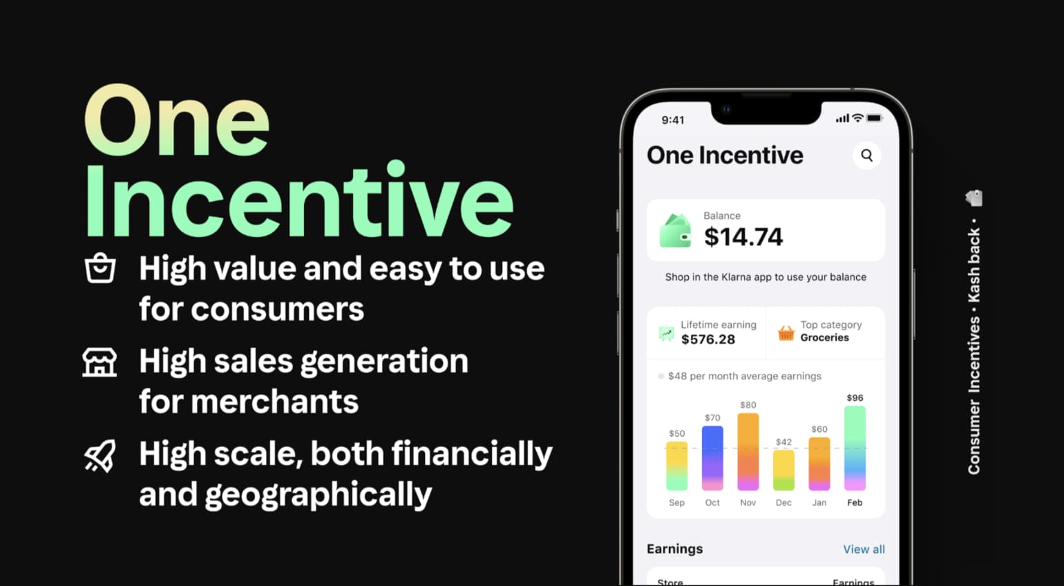

Inclusive ideation
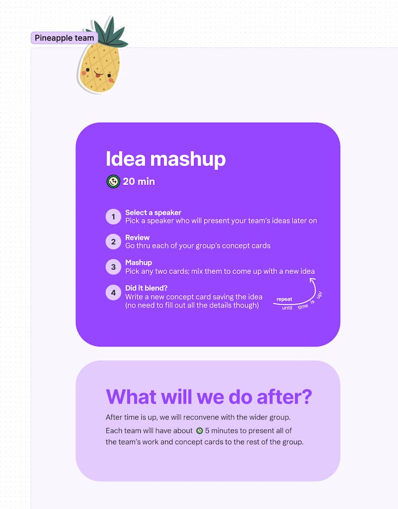
To gather ideas and involve all group members in the UX vision, I started by designing and running a workshop with each product team in the group. This allows me to frame the ideation space in close conversation with each team, while giving every participant some alone time to think and define their ideas in the background.
Instead of a traditional ideation format, I set up two sessions, one or two days apart, with each team.
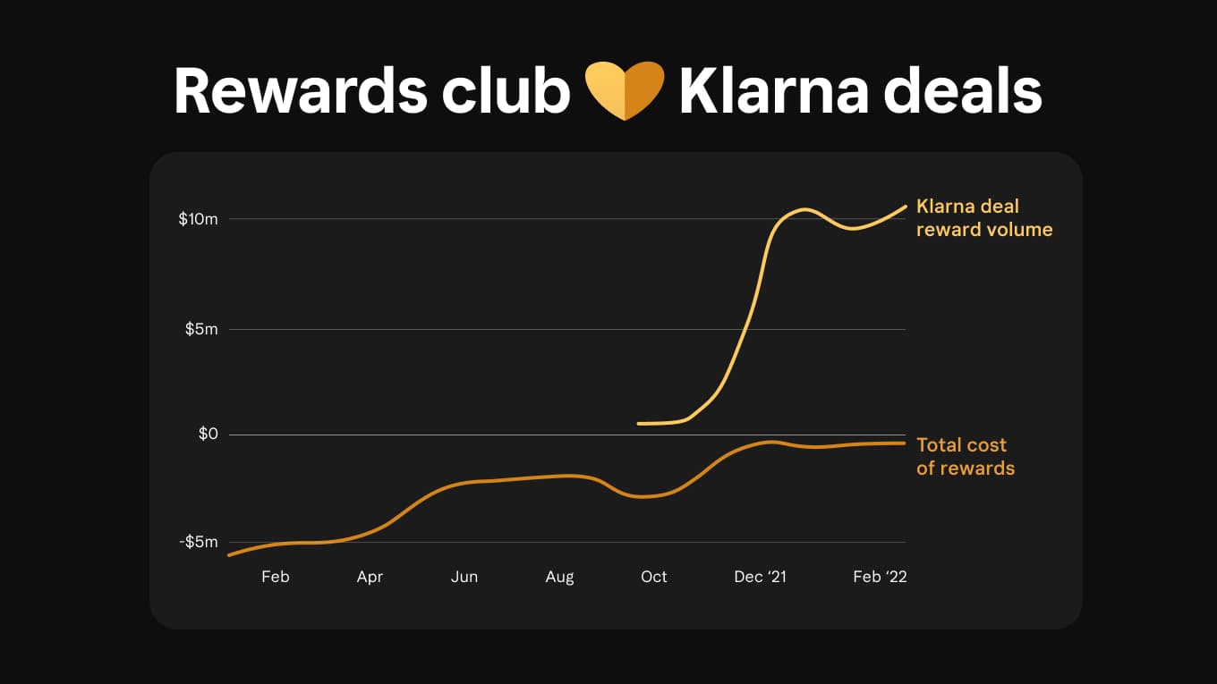
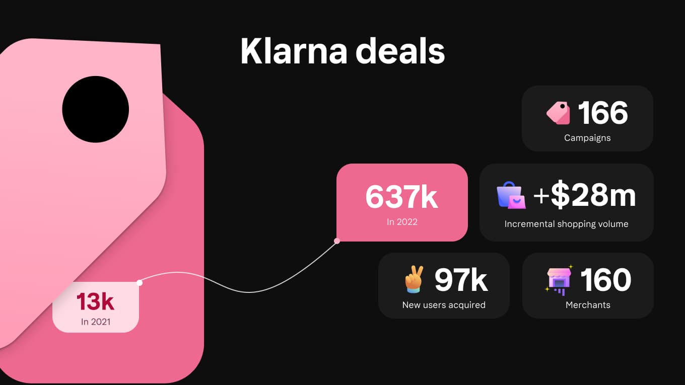
Framing ideas
The first session has the goal of framing our ideas. To achieve this, I presented a summary of the wider company strategy, as well as key user insights and datapoints in the problem area. In order to bring outside perspectives, selected collaborators of diverse specialities and relevant problem spaces from other areas of the company were invited to join each ideation session.
At the end of the first session, every participant receives a personal ideation file. This is a space to calmly gather their ideas in, ahead of the second session.
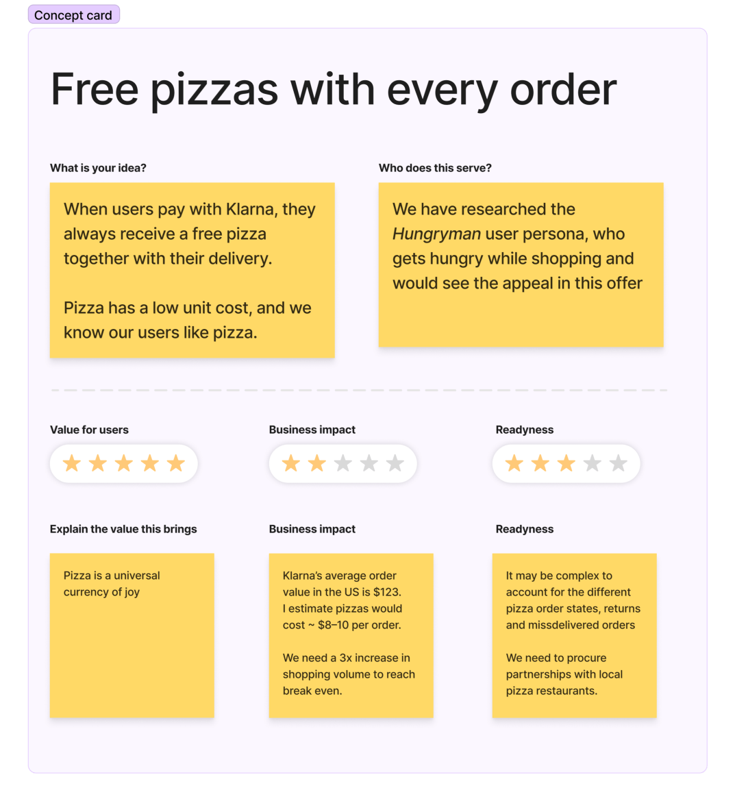
UX Vision concepts
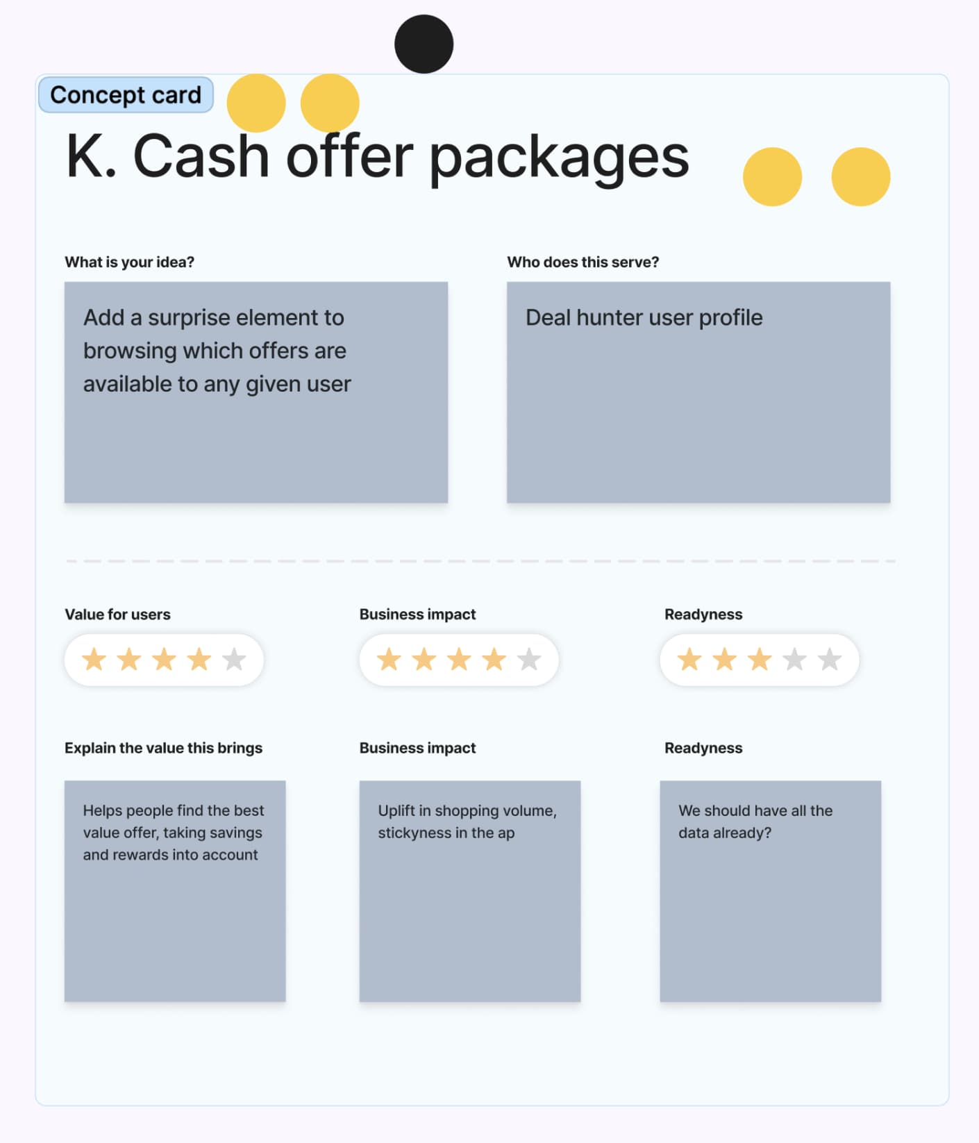
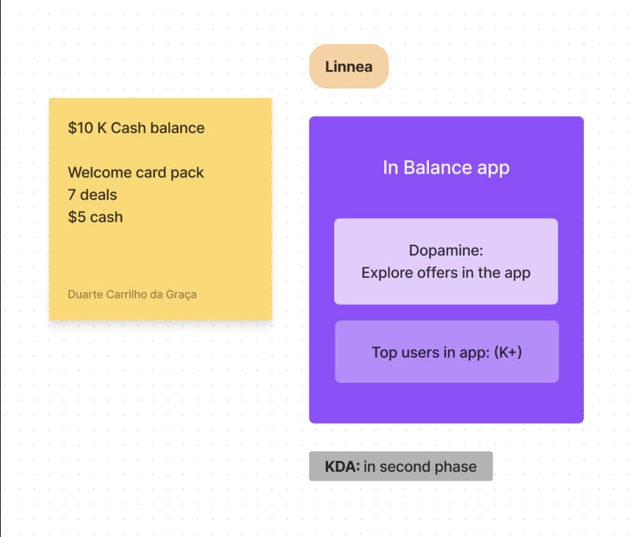
The second session starts with a new idea generation round using the time-pressured and collaborative idea generation strategies. This allows us to get the best ideas from both calm, background thinking, and time-pressured ideation. A discussion and dot-voting on all the ideas follows. All ideas are collected in a standardised 'concept card' format that is easy to work with later on.
Storytelling
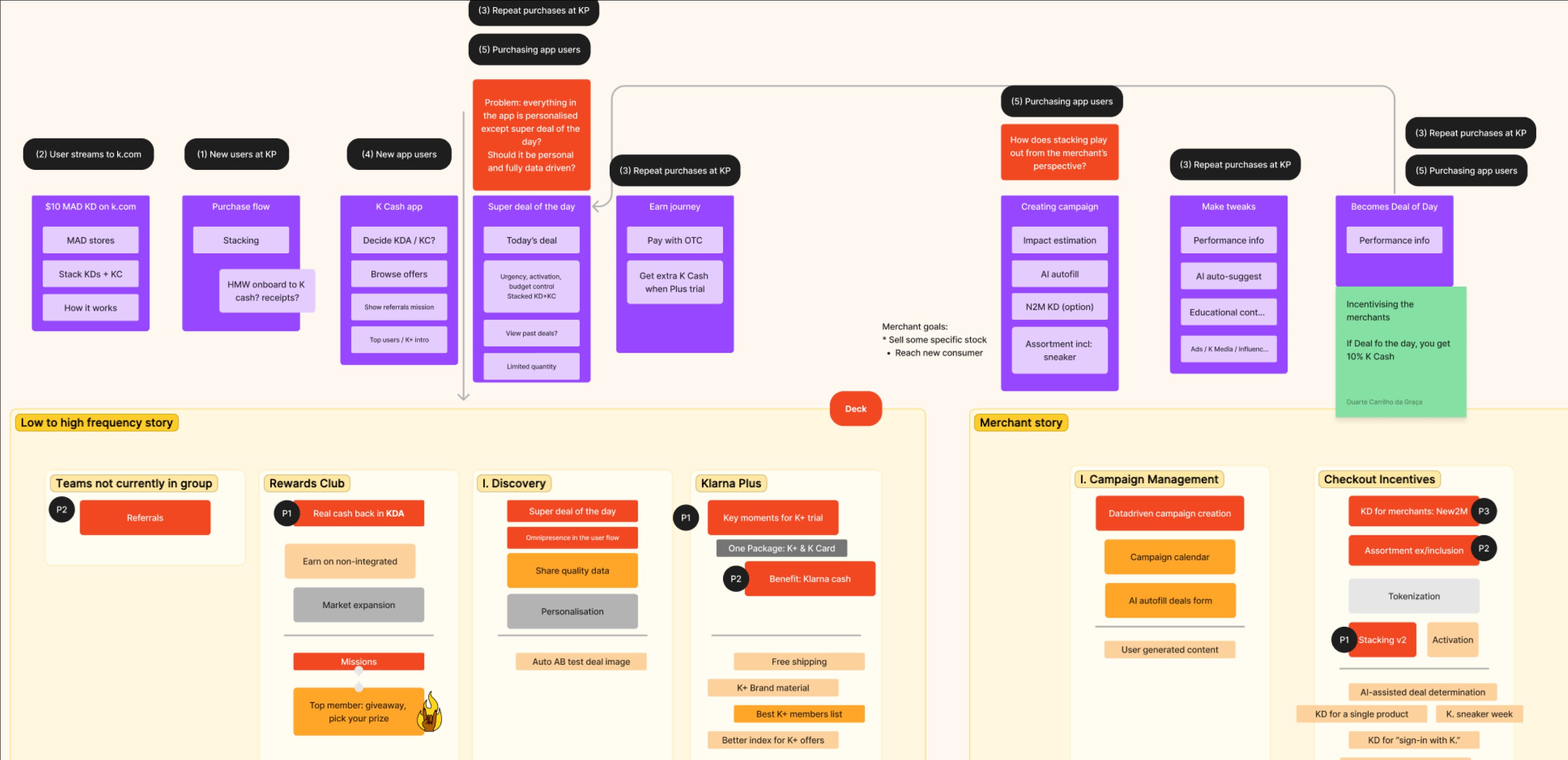
The ideation workshops are followed by a refinement process of close collaboration between the UX lead, and product director with support from UX research and data specialists. This is a key phase to weave key ideas together and form the first draft of the vision, followed by a series of tight feedback loops, iteration and design of the ux-vision experience.
A UX Vision document
Above, an initial draft of the UX Vision document in Figma. The user journeys presented are heavily contextualised by user research and data insights. In this case, we used supporting image from a popular tv series to enable a deeper connection with each of our personas. And because it was fun.
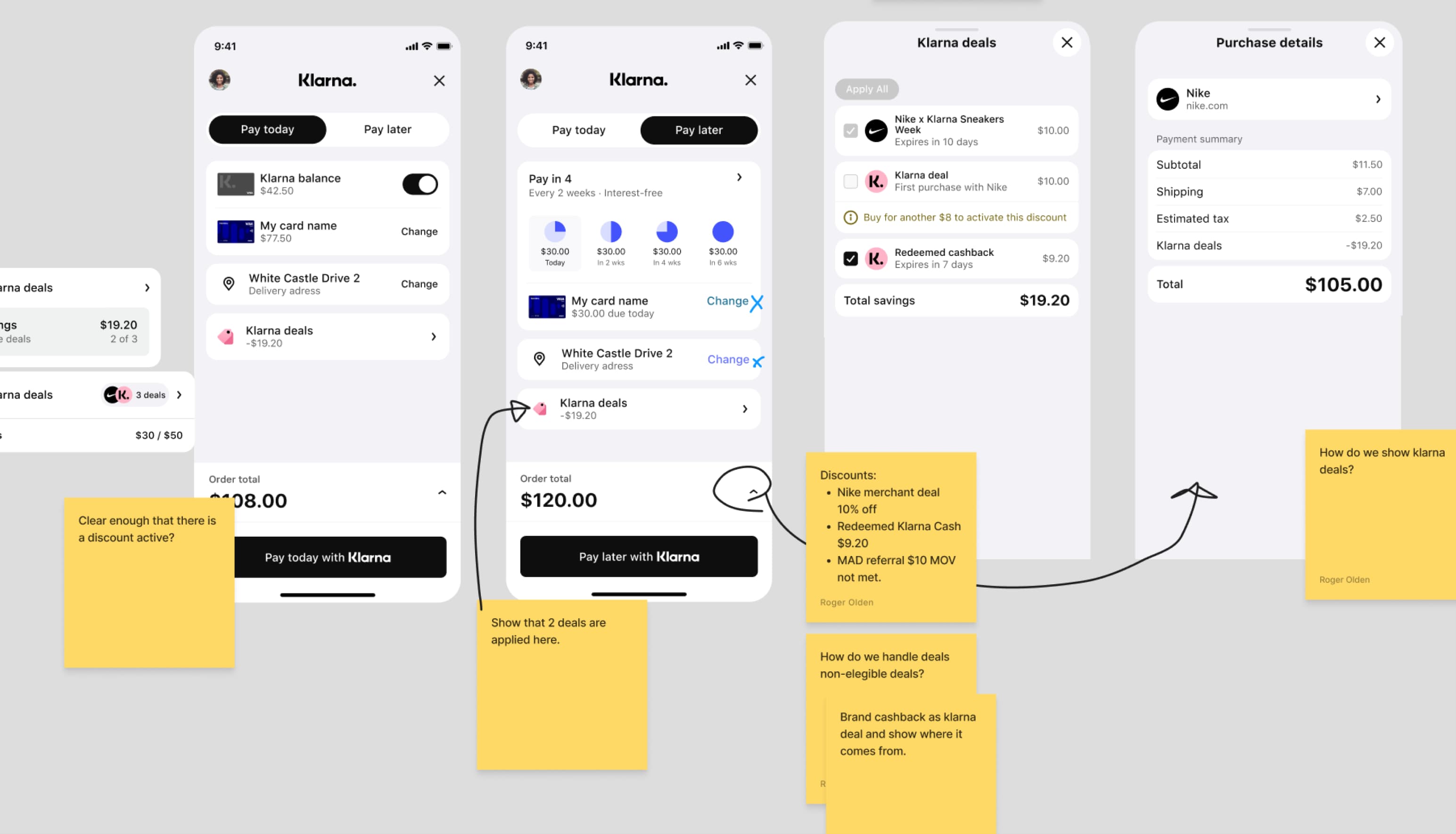
Detail view: Cashback cash packs
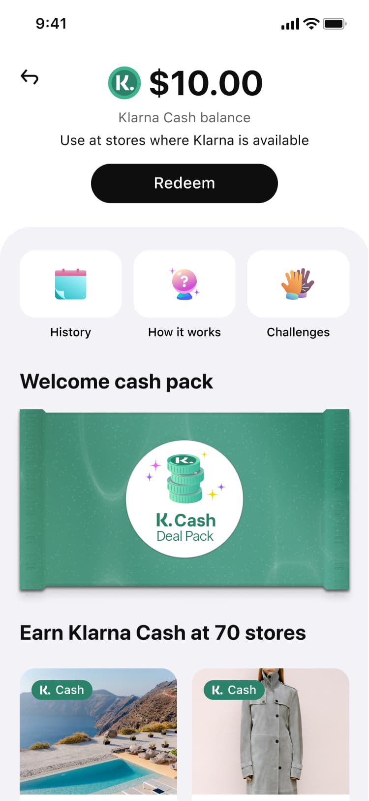
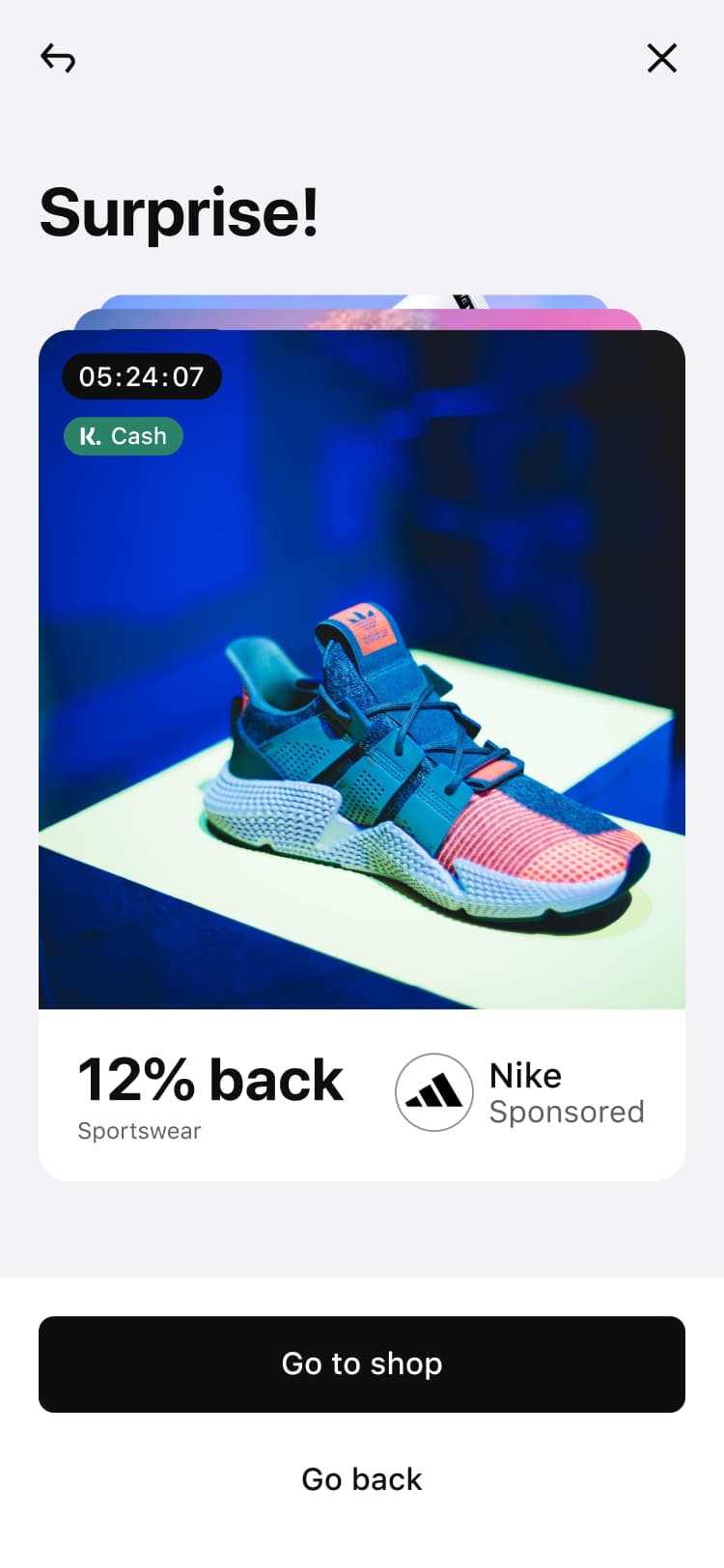
Above, an example idea-card "Klarna Cash offer packages" and it's application in the UX Vision's interactive prototype for storytelling, showing the evolution of an idea from workshop, to an early draft of the vision.
Business planning with the UX Vision
Above, a later iteration of the UX Vision document, adapted for Klarna's yearly business planning moment. Here, a shorter time is afforded to present the vision. The prototype includes an index to make it easier for busy stakeholders to follow along. In addition to the ux vision, this document also includes space for demo of the current state of each product.
A compelling ux vision allows us to engage with stakeholders from the c-suite, and bring great ideas and discussions from members of every team, and external collaborators. This sets the ground for the development of some of the ideas in our ux vision during the year to come.